Paper Against the Feed: Why UK Club Flyers Are Having a Moment Again
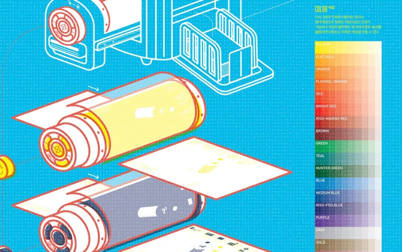
Photo: risograph club flyer pasted on brick wall London, via i.pinimg.com
On a damp Tuesday in Peckham, a flyer is doing what flyers have always done: getting slightly wet. It is A5, printed in two colours on cheap stock, and it advertises a night that will happen in a basement room with a capacity of 150. The design is not polished. The type is a bit cramped. Someone has drawn a small, wonky speaker in the corner. It looks like it was made at 2am, and that is exactly why it works.
In 2026, the UK club flyer is having a quiet revival. Not as nostalgia, and not as a replacement for Instagram, but as a tactile counterpoint to it. Walk through Dalston, the Northern Quarter, Stokes Croft or the Southside of Glasgow and you will see them: risograph posters, paste-ups, zine-style handouts, letterpress cards left on record-shop counters. They are small, cheap and stubbornly physical. They say something that a sponsored post cannot.
The wall as a feed
A social feed is infinite. A wall is not. That is the first thing a good flyer designer understands. You have a finite print run, a finite number of lampposts and a finite amount of attention from someone walking past in the rain. The design has to work at a glance and then reward a closer look. It has to carry the date, the lineup, the venue and a feeling—without turning into a poster-sized paragraph.
The best flyers treat the wall like a feed with consequences. You cannot scroll past them. You either see them or you do not. That scarcity changes the design. It encourages bold type, strong colour and a single clear image. It also makes the flyer collectible. People pin them above desks. They keep them in sleeves. They photograph them, which is the most 2026 thing possible: paper made to be shared digitally, but only after it has existed in a room.
Why paper still works
A flyer says someone cared enough to print. That sounds sentimental, but it is also practical. Printing costs money. Distribution takes time. Putting up a poster in a city that frowns on flyposting takes nerve. All of that signals commitment. A sponsored post can be bought in a few taps. A flyer has to be made, collected, carried and stuck to something.
There is also the texture. Risograph ink sits on the paper in a way that screens do not. Fluorescent pink over black, a slightly misregistered second colour, the ghost of another print on the reverse—these are not flaws. They are the visual language of a scene that cannot afford a big agency and does not want one. The zine-style flyer has become a genre in its own right: photocopied collages, handwritten lineups, a QR code placed like an afterthought because everyone knows the phone is coming out anyway.
The QR code is the compromise. It is the point where paper meets the feed. But a good flyer does not rely on it. The paper has to work first. The code is just the handover.
The designers doing it
The people making these things are rarely full-time graphic designers. They are promoters, illustrators, design students, record-shop staff and people who run the night. They use what is cheap and available: a photocopier, a Riso, two colours, a scanner. That budget aesthetic has become a style in itself, but it is not only a style. It is a way of making a visual identity that feels local rather than corporate.
A night in Leeds might use a single hand-drawn image and a brutal sans-serif. A Glasgow party might go full collage. A Bristol collective might print a sixteen-page zine and staple it badly on purpose. The common thread is not a look. It is an attitude: the flyer is part of the night, not an advert for it. It sets the tone before you get to the door.
The economics of a good flyer
Print is not free, but it is still surprisingly cheap at small scale. A short run of A5 flyers can cost less than a modest ad spend, and it gives you something you can hold. The economics only work if the design is good. A bad flyer is just litter. A good flyer is a small piece of scene infrastructure: it tells people what is happening, it makes the night feel real, and it leaves a trace.
That trace matters in a city where venues close and rents rise and scenes move. A flyer is an archive. It is a date, a lineup, a piece of artwork, a night that happened. In a few years it might be the only physical evidence that a particular room ever existed. Instagram will still have the post, but the post will be somewhere in a grid. The flyer will be on a wall, or in a drawer, or under a pint glass.
What a flyer says that a post cannot
A sponsored post says: look at this. A flyer says: we are here, on this street, on this date. It is slower, smaller and more local. It does not replace the feed, and it should not try. The most interesting nights in the UK right now are using both: a strong visual language online, and a physical object that carries it into the world.
Paper is not anti-digital. It is just another material. In 2026, that feels less like nostalgia and more like good sense. A flyer gives a night a body. And in a culture that is increasingly frictionless, a bit of friction can be a good thing.