Britain Is Bored of Looking Expensive: The Case for Getting Style Wrong in 2026
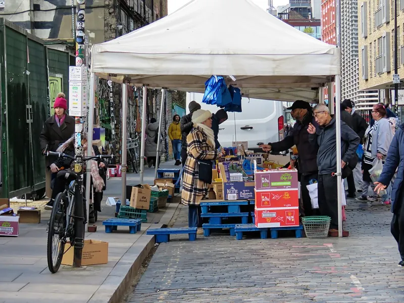
Photo: Acabashi, CC BY-SA 4.0, via Wikimedia Commons
Something has shifted in British style. For the past few years, the mood has been relentlessly well behaved: oatmeal knitwear, wide-leg trousers, neutral rooms, investment pieces, the same three shades of greige. It was quiet, it was luxury, and it was almost always algorithm-friendly. In 2026, the mood is turning. Not against quality, but against the performance of taste as a personality substitute.
You can see it in the feeds first. The flat-lay has lost its grip. The colour has crept back in — acid green, oxblood, butter yellow, electric blue — often all at once. You can see it on the high street, where the beige rail is starting to look less like a safe choice and more like a surrender. And you can see it in the way people are talking about clothes again: not as a portfolio of sensible purchases, but as something closer to play.
The beige feedback loop
The problem with algorithmic minimalism is not that it is ugly. The problem is that it is boring. When every outfit is optimised for the same grid, every room is styled for the same camera angle, and every brand uses the same vocabulary of considered restraint, taste stops being a point of view. It becomes a filter.
Quiet luxury was supposed to be a backlash against logos. In practice, it became another uniform: expensive-looking, low-risk, endlessly reproducible. The irony is that a look built on the idea of not showing off ended up showing off in the most tedious way possible. It said: I have money, or I want you to think I do, and I would rather not be asked any difficult questions about it.
By 2026, that pitch has worn thin. The cost-of-living crisis has made a mockery of the idea that the best style advice is to buy fewer, better things. Fewer, better things is fine if you can afford the entry fee. For everyone else, it is a slogan with a Waitrose receipt attached.
Taste used to be a conversation
Good taste has never been a fixed list. It has been an argument. It has been the friend who wears a shirt that should not work and makes it work. It has been the market stall holder who knows exactly why a jacket from the 1970s is better than the one on the mannequin. It has been the teenager who gets it wrong for a year and comes out the other side with something that looks like them.
The current backlash is not really about beige. It is about the difference between taste as a sensibility and taste as a shopping filter. The first is social, messy and alive. The second is a spreadsheet. And Britain is starting to notice that the spreadsheet has no sense of humour.
The market stall correction
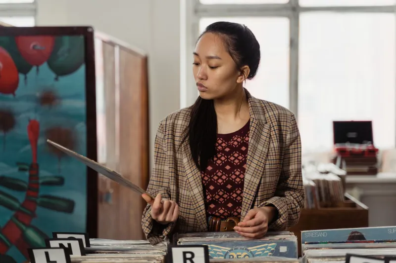
London has always had a corrective to whatever the style press is pushing. You can find it on Brick Lane on a Sunday, at Portobello before the tourists arrive, in the overflowing rails at Deptford Market. The appeal is not just cheapness. It is the randomness. You cannot algorithmically browse a pile of clothes that someone else has already rejected. You have to look. You have to touch. You have to decide whether the weird collar is a flaw or the whole point.
That is why the market stall has become the unofficial antidote to curated sameness. It produces outfits that do not look like they were assembled by a brand strategist. It rewards instinct over polish. And it is inherently social: you ask the seller where something came from, you argue about the price, you leave with something you did not know you wanted.
The same energy is turning up at vintage fairs. In Manchester, the good ones feel less like shopping and more like a swap meet with better lighting. Football shirts next to 1950s dresses. Faded workwear next to something suspiciously shiny. The point is not to recreate a decade. The point is to mix it up until it looks like you.
Wrong colour, right feeling
The most visible shift is colour. After years of beige, the high street is suddenly full of shades that do not ask permission. Tomato red. Lime. Chocolate brown. A blue that looks like it was mixed by accident. Some of it is hideous. That is fine. Hideous is a useful reaction. It clears the palate.
The rise of the wrong colour is not about being loud for the sake of it. It is about refusing the idea that the safest option is the most sophisticated one. A bright green jumper with a sensible coat is more interesting than another cream knit. An orange lamp in a grey room does more for the room than another beige cushion. Good taste can include restraint. It should not be defined by it.
Amateur styling is not a failure
There is a particular British snobbery that treats visible effort as embarrassing. The ideal is to look as if you woke up like this, which usually means spending an hour making it look effortless. The backlash against that is not about slobbiness. It is about allowing the seams to show.
Amateur styling — the belt that does not match, the skirt over trousers, the earrings that are too much, the shoes that are technically wrong — is not a failure of taste. It is a sign that someone is actually making decisions. The influencer version of style is a closed loop: buy the thing, tag the brand, wait for the likes. The amateur version is open: try it, wear it, see what happens.
That openness is what the style press seems to be catching up with. The most interesting images in 2026 are not the ones with the cleanest backgrounds. They are the ones with a bit of mess: a flash photo in a hallway, a market haul laid out on a bed, a friend wearing something that should not work. The polish is gone. The personality is back.
What good taste could mean now
None of this is an argument for buying rubbish or dressing like a clown on purpose. It is an argument for loosening the grip. Good taste could mean knowing why a thing works, not just knowing what is allowed. It could mean buying less because you love something, not because a list told you to. It could mean letting a room look lived in rather than styled.
The beige hangover will pass. It always does. The useful question is what replaces it. The answer, if the market stalls and vintage fairs and wrong-colour rails are anything to go by, is not another uniform. It is a bit more mess, a bit more colour, and a lot less fear of looking like you tried.
At SIXTEN, we are not immune to a nice neutral. But a whole country dressed like a mood board is not style. It is surrender to the algorithm. In 2026, the better move is to get it a bit wrong — and enjoy it.